What's in Store for Consoles and Controllers

Consoles and Controllers launched yesterday and I'm already thinking about some changes I'm going to make to it. It's still something I'm proud of, since it's quite a bit of work, but there are a couple things that you should expect to change over the next couple days as I get ready to put it on DriveThruRPG.
The game part I'm happy with. I'd welcome anyone's feedback as I work on revisions to the layout, since I could double-up on them and the visual changes I'm working on, but I feel pretty confident about the Charge core and the tweaks and alterations I've made.
The visual changes I'd like to do are basically as follows:
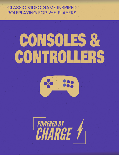
1. Each game in the setting should have a logo of its own, and will get a pastel color scheme that is equivalent to the purple and yellow-orange of the overall look. My process for the cover was working to block out the basic elements and then distressing it to see what stuck. The base colors were actually a blue and orange mixture that were visually offensive until they got crunched down like they are in the final cover. There's some loose inspiration taken from classic video game boxes, with a modern basic iconographic look, and I intend to do this for each of the games.
2. Reduce the text size and slightly increase column width. I went with a 12-pt font instead of the customary 11, and I'm not happy with how it reads. Also, where there is text with a boxed outline I intend to replace that with a faint purple-gray background box, which is an easy change.
3. Separate some sections into "sidebars" that tie into the game's identity. For instance, each of the game sections should have a panel that shows the example characters.
Yesterday I had until 5 PM my time because of some uncertainty about my schedule (I wanted to get the game up before my Tuesday night gaming group met) to finish the game, and unfortunately Affinity treated each paragraph of the imported document as having its own unique changes instead of following the setup from Word. This meant that I spent about an extra hour making sure I recreated as much of the formatting as possible, but there are some spots where changes will need to be made.
Some simple effects of these changes:
The length of the rulebook will fall dramatically, which will help with printing out copies if people want to do that.
Simultaneously, because the length relative to content will fall, and I'll have new iconographic elements, I can be a little more generous with page breaks and organize content better. Also, for whatever reason, I always have better luck with the column breaks with smaller fonts. This isn't be an iron law of typesetting or anything, as far as I know.
Also, small issues and formatting stuff that may have been missed when I was frantically trying to finish before the deadline yesterday should be fixed.
I'll also be releasing stand-alone character sheets and a template for making your own character sheet. These will be available in both .afpub and .pdf format. This will have to wait for me to get the formatting of the core rulebook done, since version 1.0 of that is my top priority right now.
The Inspire Jam Rulebook will be preserved for posterity, but the new changes should be up in a day or two.
Get Consoles and Controllers
Consoles and Controllers
Classic video game inspired roleplaying for 2-5 players
| Status | Released |
| Category | Physical game |
| Author | Loreshaper Games |
| Genre | Role Playing |
| Tags | Family Friendly, meta, Tabletop, Tabletop role-playing game |
More posts
- What's Next for Consoles and ControllersAug 17, 2022
- 0.9 releasedMar 03, 2022
Leave a comment
Log in with itch.io to leave a comment.